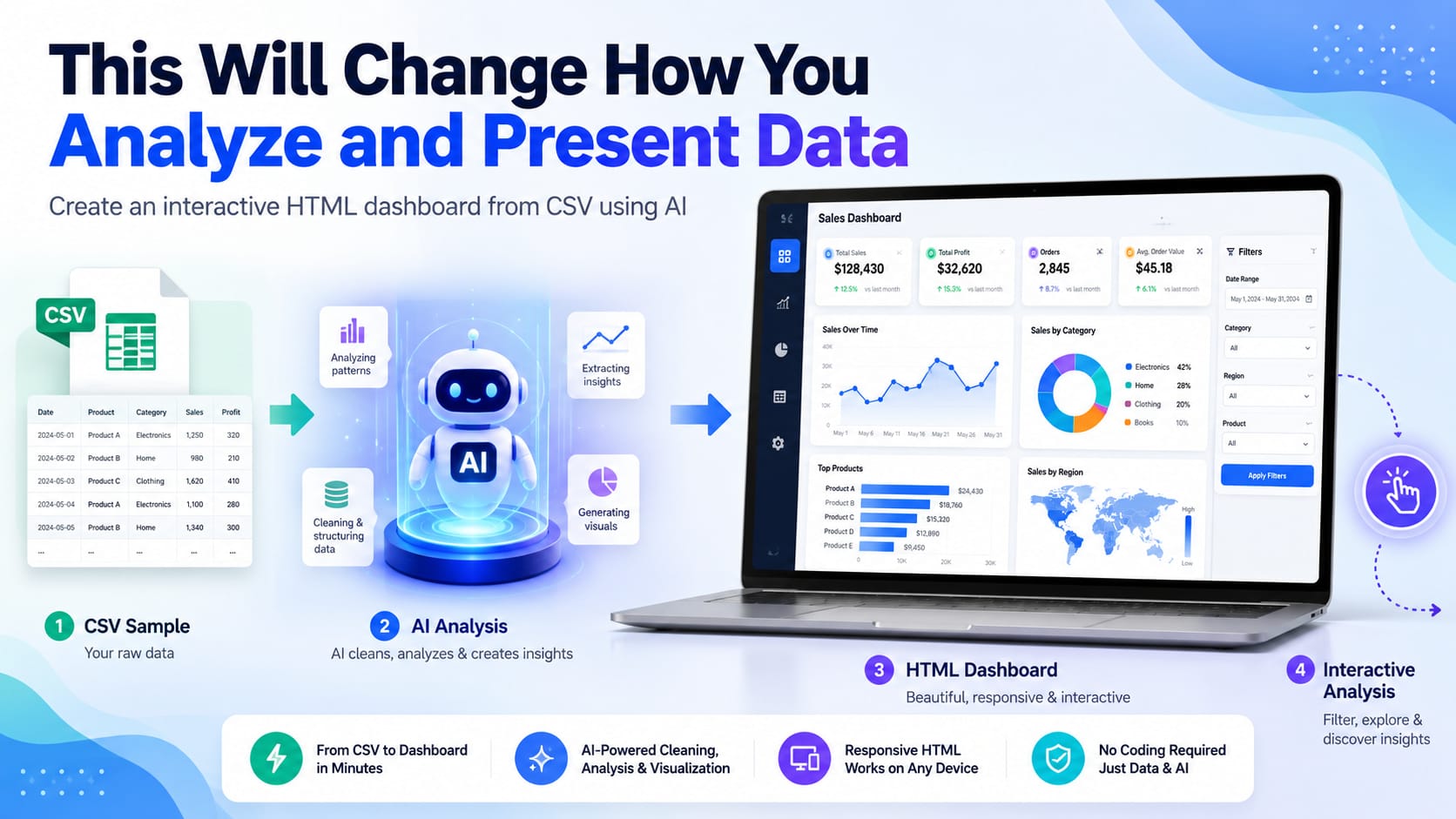
Data analysis used to require a combination of spreadsheet skills, formulas, pivot tables, chart creation, and sometimes programming.
Today, AI tools such as ChatGPT, Gemini, and Claude can dramatically change that workflow.
Instead of manually building every calculation and chart, you can give an AI tool a sample of your dataset, explain what the data represents, and ask it to create a complete interactive dashboard for you.
And you don’t necessarily need Power BI, Tableau, or even Excel to use the finished dashboard.
Table of Contents
Introduction
In this tutorial, I will show you a practical workflow for turning a CSV dataset into a single-page interactive HTML dashboard using AI.
The finished dashboard can:
- let the user upload a CSV file from their computer,
- calculate useful KPIs,
- visualize the data with interactive charts,
- provide filters,
- display detailed records,
- and update the entire dashboard when the data changes.
For this example, I am going to use the DataCoSupplyChainDataset available on Kaggle.
The Idea Behind This AI Dashboard Workflow
The basic idea is surprisingly simple.
Instead of uploading your entire dataset to an AI tool every time you want to analyze it, you first give AI a representative sample of the dataset.
The AI studies the structure of the sample and determines:
- what each column represents,
- which columns are dimensions,
- which columns are measures,
- which KPIs would be useful,
- what charts could reveal useful patterns,
- and which filters users may need.
You then ask AI to generate a complete HTML application.
That HTML page contains the code needed to read a CSV file, process the data, calculate metrics, and generate charts.
The final workflow looks like this:
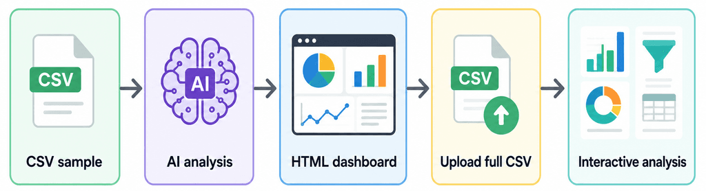
CSV sample → AI analysis → HTML dashboard → Upload full CSV → Interactive analysis
Once the HTML page has been created, you can reuse it with the full dataset without repeatedly asking AI to analyze thousands of rows.
Dataset Used in This Tutorial
For this example, I am using the DataCoSupplyChainDataset available on Kaggle:
DataCoSupplyChainDataset on Kaggle
The dataset contains supply-chain data related to areas such as orders, sales, customers, products, shipping, and delivery performance.
It is a good example for this tutorial because it includes enough fields to demonstrate KPIs, filters, charts, and other dashboard features.
You can also follow the same process using your own CSV dataset.
Step 1: Prepare a Sample CSV File
Instead of sending the complete CSV file to the AI, create a smaller sample.
Keep the column headers and around 50 to 200 representative rows.
Try to include different values, such as different product categories, countries, markets, shipping methods, and dates.
The purpose of this sample is only to help the AI understand the structure of your dataset.
The final HTML dashboard will later analyze the full CSV file.
Step 2: Upload the Sample to ChatGPT, Gemini, or Claude
Now open your preferred AI tool and upload the sample CSV file.
🚫 One common mistake is immediately asking:
Create a dashboard from this data.
That can work, but you may get better results by separating data understanding from dashboard development.
First, ask AI to behave like a data analyst.
Use a prompt similar to this:
Prompt 1: Analyze the Dataset
I have uploaded a sample CSV file from a much larger dataset.
First, analyze the structure of this dataset.
Identify:
- each column and what it appears to represent
- likely data types
- important dimensions
- important measures
- relationships between columns
- possible data-quality problems
- useful KPIs
- useful charts and visualizations
- useful dashboard filters
Do not create the dashboard yet.
First explain what kind of analysis would be most useful for this dataset.
This gives the AI a chance to understand the data before writing any code.
Why This Extra Step Matters
Before asking AI to build the dashboard, it is useful to first let it understand the dataset.
This helps the AI identify meaningful KPIs, charts, filters, and relationships instead of creating random visualizations.
For example, it may recommend metrics such as:
- Total Sales
- Total Profit
- Total Orders
- Average Order Value
- Profit Margin
- Late Delivery Rate
This usually results in a more useful and focused dashboard.
Step 3: Correct Anything the AI Misunderstands
AI is good at detecting patterns, but column names are not always self-explanatory.
For example, a numerical field may actually be an identifier.
If AI incorrectly proposes calculating an average customer ID or summing product IDs, correct it before generating the dashboard.
You could say:
Customer Id and Order Id are identifiers and should not be summed.
Sales represents the sales value.
Order Profit Per Order should be used when calculating profitability.
Shipping-related columns should be used to analyze delivery performance.
You can also explain any business rules that are not obvious from the dataset.
The better AI understands the meaning of the data, the better the dashboard will usually be.
Step 4: Ask AI to Build the HTML Dashboard
Once you are satisfied with the proposed analysis, ask AI to generate the dashboard.
Here is a reusable prompt you can adapt for many CSV datasets.
Prompt 2: Generate the Dashboard
Based on your analysis of the sample CSV file, create a complete interactive data-analysis dashboard as a single HTML file.
The dashboard must allow the user to select and upload the original CSV file from their computer.
After the CSV file is selected, automatically parse the data, perform the required calculations, and update the dashboard.
Requirements:
- Everything must be contained in one HTML file.
- The dashboard should run locally in a modern browser.
- Do not require a database or backend server.
- Include a CSV upload interface.
- Validate that the uploaded CSV contains the required columns.
- Add useful KPI cards based on your previous analysis.
- Add appropriate interactive charts.
- Add useful filters for important fields.
- Make all KPIs and charts respond to the filters.
- Include a searchable and sortable data table where useful.
- Properly parse numbers and dates.
- Handle missing and invalid values.
- Format currency, percentages, and large numbers appropriately.
- Add a Reset Filters button.
- Use a clean, modern, professional dashboard layout.
- Make the page responsive.
- Show a useful error message if an incompatible CSV file is uploaded.
The uploaded sample CSV should only be used to understand the dataset structure.
Use suitable browser-based JavaScript libraries for CSV parsing and data visualization if needed.
Do not permanently embed the sample dataset inside the HTML.
The final dashboard must perform its analysis on the CSV file selected by the user.
Generate the complete working HTML code.
This prompt makes an important distinction.
The sample dataset is used during development, while the full CSV is used by the finished dashboard.
Step 5: Generate or Save the HTML File
Depending on the AI tool you are using, it may be able to create the HTML file directly.
If a downloadable file is provided, save it to your computer.
If the AI provides only HTML code, that is also fine.
Copy all of the generated code.
Open a plain-text editor such as:
- Notepad,
- Notepad++,
- or another code editor.
Paste the code.
Then save the file as:
dashboard.html
⚠️ Be careful that Windows does not automatically save it as:
dashboard.html.txt
The extension must be .html.
Step 6: Open the Dashboard in Your Browser
Now double-click dashboard.html.
Your browser should open the dashboard just like a normal web page.
You may initially see something similar to:
Upload CSV File
or
Choose Dataset
At this point, the page does not necessarily contain the DataCo dataset.
Instead, it contains the logic required to process that dataset.
Step 7: Upload the Full DataCo CSV File
Now click the upload button and select the original:
DataCoSupplyChainDataset.csv
This is where the approach becomes particularly useful.
The dashboard can now process the complete dataset and calculate the metrics defined in the HTML application.
Depending on what the AI created, you may see KPI cards such as:
- Total Sales
- Total Profit
- Number of Orders
- Average Order Value
- Profit Margin
- Late Delivery Rate
Below those cards, you might have charts showing:
- sales over time,
- sales by market,
- profit by category,
- orders by customer segment,
- shipping modes,
- delivery status,
- best-performing products,
- and geographical distribution.
Your exact dashboard will depend on the recommendations produced during the AI analysis.
Step 8: Test the Dashboard Interactivity
Once the full CSV file is loaded, test whether the dashboard works as expected.
Try changing the available filters, such as:
- Date range
- Market
- Country
- Product category
- Customer segment
- Shipping mode
Check whether the KPI cards, charts, and data table update correctly when you change a filter.
Also test the Reset Filters option and make sure the dashboard returns to the full dataset.
If something does not work correctly, go back to the AI and describe the problem.
For example:
The Market filter updates the charts, but the KPI cards are not changing. Please fix this and return the complete updated HTML file.
This testing step is important because even if the AI was asked to make the dashboard interactive, you should still confirm that all filters and calculations work correctly.
Step 9: Don’t Accept the First Version
One of the biggest advantages of building dashboards with AI is that you don’t have to design everything perfectly in your first prompt.
Suppose the first version contains a pie chart that you don’t like.
Simply tell the AI:
Replace the product-category pie chart with a horizontal bar chart showing the top 10 categories by sales.
Or perhaps the KPI cards are too large:
Reduce the height of the KPI cards and display six cards in one row on desktop screens.
You can continue with requests such as:
Add a monthly sales trend chart.
Add a market filter.
Add a date-range filter.
Add a button to export filtered reco;
You are effectively developing the dashboard by having a conversation.
Step 10: Ask AI to Improve the Analysis
Don’t limit your prompts to visual design changes.
Ask the AI to think like an analyst.
For example:
Review the current dashboard as a senior supply-chain analyst. Identify important insights or metrics that are currently missing.
The AI may suggest additional analysis around:
- delivery performance,
- shipping delays,
- profitability,
- loss-making products,
- market performance,
- product performance,
- customer segments,
- seasonal trends,
- and fulfillment patterns.
You could then ask:
Add the most valuable three suggestions to the dashboard without making the interface unnecessarily complicated.
This produces a much more focused dashboard than simply telling AI to add as many charts as possible.
Step 11: Ask AI to Review Its Own Work
Before considering the dashboard finished, give the AI one more task.
Prompt 3: Final Dashboard Review
Review the complete HTML dashboard as both a senior data analyst and an experienced frontend developer.
Verify:
- all calculations
- KPI formulas
- date parsing
- numeric parsing
- filtering logic
- chart calculations
- missing-value handling
- CSV validation
- responsiveness
- JavaScript errors
- dashboard usability
Make sure every KPI and chart updates correctly when filters are changed.
Also check whether any visualization could be misleading or inappropriate for the data.
Fix every problem you identify.
Return the complete final HTML file rather than only the modified sections.
The last sentence is particularly useful.
Without it, an AI coding assistant may respond with only a few modified functions.
When you aren’t manually maintaining the code, receiving the complete HTML again is often easier.
Step 12: Verify the Numbers Yourself
AI-generated dashboards still need validation.
Suppose the dashboard says:
Total Sales: $36,000,000
Don’t automatically assume that calculation is correct.
Open the original CSV in Excel, Google Sheets, Python, or another trusted analysis tool and independently calculate several important metrics.
Compare:
- total sales,
- transaction counts,
- profit,
- averages,
- and filtered results.
If the numbers match, you have much more confidence that the dashboard logic is correct.
This is especially important when AI has to interpret:
- duplicate records,
- missing values,
- percentages,
- currency fields,
- date formats,
- or multiple records belonging to the same order.
AI can greatly accelerate dashboard development, but validation remains the analyst’s responsibility.
One Important Advantage: Your Full Dataset Can Stay Local
There is another useful aspect of this architecture.
You gave the AI service a sample dataset while developing the dashboard.
But when the finished HTML dashboard uses JavaScript to read a CSV file locally, the full CSV can potentially be processed directly inside your browser.
In other words, you don’t necessarily have to repeatedly upload the full dataset to the AI service simply to use the dashboard.
However, you should not automatically assume that every AI-generated HTML application is completely offline.
Check the generated code.
It may load external JavaScript libraries, fonts, APIs, or other online resources.
If you are working with confidential organizational data, review the application’s network behavior and code before using it.
Can the Dashboard Work Completely Offline?
Potentially, yes.
If the AI generates the dashboard with all required JavaScript included locally and doesn’t depend on external APIs or CDNs, the page can potentially operate without an internet connection.
You could tell the AI:
Modify the dashboard so it can operate completely offline. Do not depend on external APIs, CDN-hosted libraries, fonts, analytics services, or external network requests.
Depending on the libraries involved, this may make the resulting HTML file larger, but it can be useful for private or offline environments.
What Happens When the Dataset Changes?
Suppose you receive an updated DataCo CSV next month.
If its column structure remains the same, you may not need to rebuild the dashboard.
Simply open:
dashboard.html
and upload the new CSV.
The dashboard can calculate everything again using the new data.
This is an important difference between an AI-generated report and an AI-generated dashboard application.
A report analyzes one dataset.
The HTML application can potentially analyze multiple future versions of the same dataset.
A Powerful Prompting Technique: Give AI Roles
I have also found that explicitly assigning roles can improve the result.
Instead of saying:
Improve my dashboard.
Try:
Act as a senior supply-chain data analyst and senior frontend developer.
Review this dashboard from both perspectives.
From the analyst perspective, improve the KPIs and visualizations.
From the frontend-development perspective, improve usability, responsiveness, performance, and error handling.
This encourages the AI to think beyond visual appearance.
What You Can Build With This Method
The same method isn’t limited to supply-chain data.
You could use it for CSV files containing:
- sales transactions,
- website traffic,
- survey results,
- marketing campaigns,
- inventory,
- transportation data,
- financial transactions,
- employee records,
- project data,
- customer-support tickets,
- school results,
- sensor readings,
- or operational statistics.
The general workflow remains the same:
Give AI a representative sample → explain the data → discuss useful analysis → generate the dashboard → upload the complete dataset.
How This Is Different From Simply Uploading a CSV to AI
You may wonder why you shouldn’t simply upload the complete CSV to ChatGPT or Gemini and ask:
Analyze this data.
That is useful for one-time analysis.
But this method creates something different.
You are asking AI to build a reusable analysis interface.
Once the HTML dashboard exists, another person could potentially open it and upload the dataset without needing to know the prompts used to create it.
That makes this approach useful when you want to distribute an analysis tool rather than just receive a one-time answer.
What About Power BI, Tableau, Excel, or Looker Studio?
This method does not make traditional analytics tools unnecessary.
Platforms such as Power BI, Tableau, Excel, Google Sheets, and Looker Studio offer capabilities that a simple AI-generated HTML dashboard may not provide.
These can include:
- database connections,
- scheduled refreshes,
- access control,
- enterprise governance,
- collaboration,
- sophisticated data modeling,
- very large datasets,
- and centralized reporting.
The HTML approach is particularly attractive when you need something:
- lightweight,
- highly customized,
- quick to prototype,
- easy to distribute,
- or able to work with locally selected CSV files.
The right tool depends on the problem.
Large CSV Files Can Still Be a Challenge
Remember that the browser is doing the processing.
A dataset containing several thousand or tens of thousands of rows may work comfortably depending on what the dashboard does.
But as datasets become much larger, loading, filtering, sorting, and charting everything in browser memory can become slower.
The DataCo dataset itself contains roughly 180,000 transactions according to one Kaggle listing, making it a useful real-world test of browser performance. (Kaggle)
If your dashboard becomes slow, you can ask AI:
Optimize this application for large CSV datasets. Reduce unnecessary loops and repeated calculations, minimize DOM updates, and improve filtering and chart-rendering performance.
For extremely large datasets, however, a database, server-side processing, or dedicated BI platform may still be the better solution.
The Real Skill Is Changing
There is a larger lesson here.
In the past, building this dashboard might have required knowledge of:
- HTML,
- CSS,
- JavaScript,
- CSV parsing,
- data aggregation,
- chart libraries,
- responsive web design,
- and data analysis.
Knowing these skills is still valuable.
But AI makes it possible for many more people to build these tools without manually writing every line of code.
The important skill increasingly becomes the ability to clearly explain:
What does this dataset represent?
What questions should we answer?
Which metrics matter?
How should users interact with the analysis?
What does a correct result look like?
In other words, the value shifts from simply knowing how to produce a chart toward knowing which chart should exist and why.
A Reusable Master Prompt
If you want to try this technique with another CSV file, here is a shorter reusable prompt.
CSV-to-Dashboard Master Prompt
Act as a senior data analyst and frontend developer.
I have uploaded a representative sample from a larger CSV dataset.
First understand the dataset, its columns, data types, dimensions, measures, relationships, and possible data-quality issues.
Determine the most useful KPIs, filters, charts, trends, comparisons, and exceptions that should be presented.
Then create a professional interactive dashboard as a single HTML file.
The application must allow the user to upload the full CSV file from their computer and perform all calculations from the uploaded data.
Do not embed the sample records.
Add:
- CSV upload
- data validation
- KPI cards
- interactive filters
- appropriate charts
- responsive layout
- searchable data table where useful
- Reset Filters
- good number/date formatting
- missing-value handling
- clear error messages
All charts and KPIs must respond to filters.
Use browser-based JavaScript so the dashboard can run without a backend.
Optimize it for reasonably large CSV files.
Finally, review your own calculations and code for errors before producing the complete HTML.
Save this prompt somewhere.
You can reuse it with many different datasets by adding a few lines explaining the purpose of your data.
Wrapping Up
AI is not simply making it faster to write formulas or generate charts. It is changing the entire workflow between raw data and a finished analytical application.
With the approach demonstrated here, we can start with a large CSV dataset such as DataCoSupplyChainDataset, give AI only enough information to understand its structure, discuss the best way to analyze it, and then ask AI to build the application that performs that analysis.
After that, the HTML dashboard becomes reusable.
Open the file.
Upload the latest CSV.
Explore the data.
Change the filters.
Find the important information.
And if you don’t like something?
Go back to the AI and describe what you want changed.
That conversational development process is what makes this approach particularly interesting.
It doesn’t mean that data-analysis knowledge is becoming unimportant. In many ways, the opposite is true. AI can generate a hundred charts very quickly.
The valuable skill is knowing which five charts actually help someone make a better decision. And that is why I believe this approach really could change how we analyze and present data.